Monday, April 30, 2012

The New Salvador Dali Museum


I'm writing this near Tampa Bay on the west coast of Florida while visiting friends. I've never been here before, so sightseeing has been the priority. One site was the Salvador Dalí Museum in St. Petersburg.

The collection is reputed to be the best outside Spain, assembled by a wealthy Dalí fan over a period of decades starting in the early 1940s; click on the link for details. What's new is the building, which opened 11:11 a.m. on 11 January 2011 -- for any numerologists out there, that translates to 11-11-1-11-11.

The collection includes a few of Dalí's huge later works. But what interested me was how many paintings there were from his teenage years and elsewhere in his pre-Surrealist days. I consider the museum worth a visit if you're a Dalí fan or even just somewhat interested in him and his work. Be aware that the admission price is a little on the high side, 19 dollars.

Photography was not permitted on the gallery floor, so what you see below is what I could take.

Gallery

Museum exterior with Dalí signature

Other views of the exterior

Dalíesque display between the gift shop, café and ticket desk

Chauffeur wearing diver's helmet
Dalí once tried to give a talk dressed in a diving suit and nearly suffocated.

"Mermaid" in back seat
The passenger compartment is filled with a plastic "shower stall" of sorts where from time to time water sprays down on the mermaid mannequin. Thanks to the "shower stall" plastic and the car windows, there are layers of reflection of posters on the opposite wall mostly obscuring the mannequin. Quelle Surrealisme!!

Friday, April 27, 2012

What They Say and What We See


I don't get many unsolicited emails. Where I can, I usually unsubscribe. A few sources I let linger on for a while due to cussedness or idle curiosity on my part. I recently received one from somebody named Aron Packer who apparently operates an art gallery in Chicago; he was touting an upcoming show. I was about to zap it when the thought struck me that I was being handed a nice bit of blog material -- and if there's one thing a blogger needs, it's new material to blog about. The big, fat juicy blog fodder? -- some notes about artists in that upcoming show.

One of that things that induces a gag-reaction from me is arty talk, either verbal or written. The worst is art-gush, and even long descriptions and analyses of paintings can something elevate my reaction from glazed eyes to incipient gag. I'm of the school of thought shared by Harley Earl, the legendary creator of styling at General Motors, who shut styling staff members up by announcing that if a design or design feature required explanation, it couldn't be of any use in a production car; its merit had be be visually obvious.

This being an art and design blog, I have to write about the images I display. But I try to keep things short, dwelling mostly on technical matters and minimizing or ignoring social or psychological factors that might (or might not) have driven the artist to do what he did.

And I try to avoid the gushy, pretentious verbiage of the kind that Packer included in his email. Though I understand that he was engaging in marketing to a target audience of art critics and other writers on art who probably do not share the biases I just mentioned.

Here is what was written about Paul Lamantia:

"Of all the strategies, notions, and approaches to modern art, for Lamantia there was never a choice, but a desire to follow a certain direction, that came in the form of an obsession. That obsession was with his dreams and visions, and the need to record and communicate his feelings about them. It is difficult because the work is always changing. It is in a constant state of flux where narrative and psychological possibilities are set in motion and clairvoyant and hallucinatory occurrences can become painted realities. There is no fixed approach to these aesthetic problems Lamantia has created for himself. The works are structured in a subjective state within certain compulsive confines meant to draw the viewer into the dream. It is not always possible to make the illusion accessible to the viewer. The intention is not to illustrate, but to translate them into something real in the form of meaningful images. There is no preconceived planning of visual invention or execution of materials. This method creates artistic challenges and needs that may only be satisfied by exploring new ways to express one's vision and to express one's aesthetic problems. To base the work on conceptual or formal values would be a misinterpretation. The paintings and drawings are meant to be introspective events and should be experienced on an emotional level."

Below is an example of Lamantia's work I found on the Web.


Other examples look fairly similar, so I suspect that the business about dreams, visions, obsessions and much of the rest is simply marketing blather from the point of view of the artist (who would likely strongly deny it was marketing blather). My take is that the guy simply likes to paint that sort of semi-surrealist stuff and has evolved a style that sells well enough to for him to usefully supplement any retirement income following a 25-year stint as a public schools art teacher.

Next, Packer writes about Brett Eberhardt:

"The imagery in Eberhardt’s paintings invite the type of reflection that occurs when one slowly observes one’s surroundings and realizes the human activity, both intentional and unintentional, that led to the current physical state of an interior space and the objects within it. It can be a beautiful thing, this combination of intentional and unintentional actions accumulated over time. The result of use and wear can be unpredictable, even mysterious, making what was once a plain white wall an abundantly rich surface and subject. This change that occurs over time and activity have a lot in common with the sequence of events that take place when building a painting. His painting process starts as a very controlled deliberate act, but over time becomes an embrace of all that painting has to offer, including those unexpected occurrences that can be so crucial to the life of a painting. Although he is after a convincing rendering of the subject, Eberhardt is not interested in creating a slick artificial surface or a hyper realistic image. The construction of the image with paint comes at the forefront and serves as a compelling record of his activity and process, a combination of intention, accident, deconstruction and reconstruction. It is important that these images are constructed with this material, not simply to elevate the subject, but for the discovery and possibilities of the medium used to construct the image."


Above is an example of Eberhardt's work. The text strikes me as pretty much an elaborate and dramatized discussion of the process most painters go through when executing a painting -- hardly a struggle of cosmic dimensions in most cases. After all, Eberhardt seems to be basically painting still lifes of one kind or another. All the verbal drama seems to be just more marketing.

Please note that I'm all in favor of marketing art and artists. I also happen to think that something less extravagant than what I quoted above ought to work just about as well as Packer's verbal pyrotechnics.

Wednesday, April 25, 2012

Century 21 Exposition: Civic Symbolism From 50 Years Ago


Fifty years ago this month Seattle's Century 21 Exposition opened for its six-month run. It attracted a lot of attention because it was the first world's fair hosted in the United States since 1940. The Wikipedia entry about the fair is here.

The theme of the fair had to do with science and the progress that might be expected by the turn of the century 38 years in the future. Because it was a small-scale fair, it lacked special pavilions funded by other countries. Most of the international and private corporate displays were in nondescript temporary structures, some of which were torn down once the fair ended.

There were three important specially built structures including the Space Needle. I'll elaborate on the Needle following the Gallery section below.

Gallery

Contemporary aerial view of fair
The Washington State Coliseum is the large building to the right. The Space Needle, whose top was painted orange in 1962, is near the center and the Science Pavilion is the cluster of white structures to the right of it and just above the Coliseum. Note that Seattle's 1962 skyline isn't very tall, the Space Needle being the highest structure in town.

Washington State Coliseum
A 1962 view of the Coliseum and a plaza where flags of the sates were displayed. It was later converted to a sports arena for basketball and ice hockey.

United States Science Pavilion
This is now the Pacific Science Center, an educational facility.

Space Needle as shown in a promotional rendering

San Antonio Tower of the Americas - 1968
A tower built for the HemisFair exposition.

Toronto CN Tower - 1976
Once the tallest self-supported structure in the world, it remains the highest in North America.

Space Needle and Seattle Skyline - recent
Seattle's Skyline has grown considerably over the last 50 years and the Space Needle is no longer the highest structure. However, it is located far enough from the central business district that it remains distinctive and not buried amongst office buildings and condominiums.

The Space Needle was inspired by a television tower in Stuttgart, Germany. Since 1962 a number of towers resembling that in Stuttgart have appeared, such as those in San Antonio and Toronto. Many of those towers were probably intended as symbols of their location.

I might be wrong, but my impression is that most or even all of those tall towers have come up short (pardon the expression) where being symbolic is concerned. And I think the problem is that those towers were designed by architects and engineers in nice, clean, functional ways that resulted in them seeming pretty similar to one another.

Towers that succeeded in symbolizing their city can be counted on the finger of one hand. Actually, two fingers are all that is needed, because in my opinion only Paris' Eiffel Tower and Seattle's Space Needle unmistakably define their cities in the eyes of the rest of the world.

But why? The answer, I believe, is because their structural shapes are as much decorative as functional, unlike the others that seem to be variations on the theme of a large post with an observation deck placed at or near the top. In the case of the Space Needle, what makes it distinctive is that it is supported by three legs, and that makes it awkward-appearing from many viewing angles. But without that awkwardness, it would be just another modernist tower.

Monday, April 23, 2012

In the Beginning: Alfred Henry Maurer


Alfred Henry Maurer (1868-1932) was an early American convert to European avant-garde modernism as practiced in the first decade of the 20th century, publicly proclaiming his conversion to The Cause around 1908. His Wikipedia entry is an odd, personalized piece that somehow escaped the "needs improvement" filter, so I suggest you try this link for a biographical sketch. His death was by suicide.

Nowadays Maurer seems to be an art history footnote, though he was known to the cognoscenti during his lifetime. Lewis Mumford, who I wrote about here, mentioned Maurer several times during his years as art critic for the New Yorker magazine; his columns have been collected in this book, which (pages 137-38) is my source for the quotations below.

"History knows him as the first American to return to this country animated by the new vision that was plaguing the Wild Men of Paris. (Before that time he had been in the line of Whistler and Dewing.) In 1908 Mr. Alfred Stieglitz showed Maurer's new work at '291' [Stieglitz's gallery] and at that moment American art began to move at right angles to its previous course."

"People knew that Maurer had talent. His flower pieces where charming, often brilliant; his elongated female heads, though a bit perturbing when repeated too often, were good. But though the notes were clear and the pitch true, the melody itself seemed limited. Had Maurer nothing else to say?"

"Of all the painters who developed abstract art during the last 20 years [this was written 1934-35], struggling for new symbols to express new states of mind and feeling, Maurer was one of a handful of genuine moderns who really felt these abstractions as experiences. His Cubist paintings are exciting and effective canvases; and if they were seen in the early days, one wonders that they did not attract greater attention. Nor was his success with these abstractions a matter of a momentary fresh vision that died out with repetition. The man kept on growing as a painter to the very end of his life..."

"Though it is too early to place Maurer -- if only because acquaintance with his work as a whole comes so tardily [Mumford was viewing a memorial exhibiiton] -- one can hardly doubt that he will count among the leaders of his generation rather than among the camp followers."

That said, let's take a look at examples of Maurer's work.

Gallery

Two Heads - 1929

Untitled portrait - n.d.

Head of a Girl - 1929
The images above are examples of Maurer's modernist treatment of the human form. he also did Cubist-inspired still lifes.

Below are examples of his pre-modernist painting. Apparently 1901 was an especially productive year for him.

Self-Portrait - 1896-97

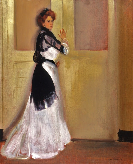
Girl in White - 1901

An Arrangement - 1901

Young Woman in a Kimono - 1901

I think Mumford was correct when he stated that Maurer had talent and that he caught the spirit of early 20th century modernism well. Moreover, it is important not to forget the times in which Maurer lived. As can be seen, he was a very competent traditional painter by the time he was in his thirties. And in his late thirties he abandoned all that, taking a professional gamble that the Fauves (and soon the Cubists) would transform art and not become flashes in the art history pan. This took a lot of courage.

That said, I find Maurer's modernist works to be quite ugly. It astonishes me how he was able to transition from producing attractive images to those that were the exact opposite while maintaining the conviction that he was doing the correct thing. Or perhaps not; he did kill himself, after all.

Friday, April 20, 2012

Three Faces Along El Paseo


There are several small cities that punch above their weight where the presence of art galleries is concerned. I'm less familiar with the eastern and central parts of the USA than I used to be, but here in the west places that come to mind are Taos and Santa Fe in New Mexico, Scottsdale in Arizona and Carmel-by-the-Sea in California.

Also in California is Palm Desert in the state's ritzy winter vacationland with its scores of golf courses, tennis clubs, time-share condominiums and nice restaurants. The heart of the Palm Desert gallery scene is El Paseo, a fancy shopping street where the galleries compete for the shopper's dollar with the likes of Saks Fifth Avenue, St. John, Bottega Veneta, Burberry, Escada and Gucci.

I was checking out the galleries recently, taking notes on artists whose work interested me in terms of blog subject material. Mulling things over, I thought it might be interesting to compare how three different artists dealt with the human face. Let's take a look:

Gallery

By Adrian Gottlieb
Gottlieb is a traditionalist who focuses on the human face and figure in near (but not quite) photorealistic style.

By John Erickson
When I "studied" art at the University of Washington, one of my instructors was John Erickson. But not the John Erickson whose painting is shown above. That John Erickson instructs drawing and probably other subjects at the University of Utah. Clearly Erickson knows how to construct a human face. But since he considers himself a modernist of some ilk and perhaps needs to feature a signature style to market his paintings, he adds bits to the basics. Such features include odd, unexpected colors, small geometrical patches such as you see here, and even small collage additions. Thanks to the generally correct underlying drawing, these add-ons can be tolerable in cases where Erickson restrains himself (which he doesn't always do). He also does abstract art.

By Vladimir Cora
Cora, a Mexican, does crude-looking expressionist near-abstractions, this one based on a face. I regard it as ho-hum modernism that offers me, at least, little of interest.

It should be noted that paintings by these artists are in major Palm Desert galleries and presumably have audiences of potential buyers. The range of styles is typical of the gallery scene along the Paseo.

Wednesday, April 18, 2012

Russell Patterson's Advertising Art


Russell Patterson (1893-1977), as his Wikipedia entry indicates, was more than just a cartoonist. Yet his witty and well-drawn Roaring Twenties flappers exemplified the era as much as the cartoons of John Held, Jr. and, to my mind, they were better than Held's (whose cartoon work I admire).

Moreover, Patterson's career didn't fade during the Great Depression. He tweaked his style, switching from pen to the more fashionable (in the 1930s) brush, and his popularity continued on its merry way.

Patterson also did advertising art. I located examples in the Art Directors Club of New York issues of the Annual of Advertising Art for 1929 and 1930. These were done for the New York Central Railroad and are shown below dated circa the year before the publication of the annual in which they appeared. Those images are spruced up photos rather than scans because I found the annuals in the stacks of a college library and it was most convenient to grab the images via digital camera; apologies for the less-than-perfect quality.

Here they are along with other examples of Patterson's work of that vintage to set the scene.

Gallery

Life cover - 28 September 1928
One of Patterson's better-known covers.

Life cover - 26 April 1929
The eyes on the flapper on the left remind me of the way Kees van Dongen did female eyes.

Cartoon - n.d.

Art for New York Central Railroad advertisement - c.1927
This illustration is similar to his cartoon style, but more dignified.

Art for New York Central Railroad advertisement - c.1928
No trace of cartoon here; a nice interior view of New York's Grand Central Terminal.

Monday, April 16, 2012

Sir William Orpen: Portraits, Women and War


I had hoped to do a posting on William Orpen (1878-1931) several years ago when I was part of the 2Blowhards blogging team, but co-blogger Friedrich von Blowhard claimed dibs on Orpen. Time passed and 2Blowhards closed down as a going concern (though as of when I write this, it can still be accessed) and Friedrich had never got around to doing that Orpen post.

Orpen's Wikipedia entry is here if you want biographical information. His background was somewhat unconventional, being a Protestant born in the Dublin area and sympathetic to Irish independence. His service as a war artist, as was true of many others in that work, was psychologically upsetting, though his effort led to his knighthood. Orpen died age 52 after a several months stay in a nursing home. It is suggested in this book (page 43) that Orpen was suffering second-stage syphilis.

His work was uneven, some paintings being sketchy with an expressionist overtone. On the other hand, his portrait work (aside from a number of quirky self-portraits) was usually very good. This was reflected in his earnings, which in the 1920s, were on the order of a million dollars a year in 2012 money.

Orpen's works are seldom seen here in the United States. A few years ago I did come across two portraits at the Fioli Mansion on the peninsula below San Francisco. They were nicely done.

Here are some examples of his work.

Gallery

Zonnebeke - 1918
One of the paintings he did as a war artist.

A Bloomsbury Family - 1907-09
Note the funny expressions on the faces of the children. The area on the lower right is cracking badly; click to enlarge.

Self-Portrait - "Ready to Start" - 1917
This apparently was painted around the time Orpen was to set off for the Western Front. For some reason, although he was a master draftsman, Orpen was almost never able to depict the British helmet correctly. This is one of his better efforts.

Self-Portrait - 1924
The regress of the mirror images is an interesting stunt, but I'm including this image because the palette suggests some of the paints he was using.

Sir Adrian Carton de Wiart - 1919
Carton de Wiart was a supremely colorful character as his Wikipedia entry indicates. He lost an eye and an arm in combat, was awarded the Victoria Cross, was a prisoner of war in Italy, represented Churchill in China and told off Mao Tse-Tung, among many other exploits. Orpen's portrait make Carton seem deceptively mild despite the small scowl.

Augustus John - 1900
Born the same year as Orpen, a fellow Slade School student and equal or superior as a painter of portraits, John also out-ranked Orpen as a seducer of women.

Grace Knewstub - 1907
Grace later became Orpen's long-neglected wife.

Gertrude Stanford
I'm not sure when this was painted, though the sitter's hairdo and clothing suggest the 1920s.

Mrs. St. George - c.1912
Evelyn St. George was Orpen's long-time mistress. Her social connections help advance his career.

Friday, April 13, 2012

Santa Barbara Biltmore: Inside Story


I sometimes wonder how many modernist hotels can be called lovable. Some are enjoyable because they function well or perhaps are in a really nice setting. But even though I might have fondness for them, I can't say I love them.

Certain older hotels are a different story, and it has to do with their architecture and interior decoration. One thing that was largely lost once modernism became the religion of architecture was a connection to deep levels of human psychology; pure geometric forms of glass and metal do not suggest comforting shelter to the extent traditional architecture does.

To illustrate the non-modernist side of this coin, consider the Santa Barbara Biltmore. Well, that's not its actual name: it is actually the Four Seasons Resort The Biltmore Santa Barbara. And it's not actually in Santa Barbara, but in Montecito, a ritzy town just east of there.

The hotel website is here and the Wikipedia entry here. As Wikipedia indicates, the hotel was renovated a few years ago with an eye to restoring the Spanish Colonial style building as reasonably as possible to its appearance at its 1927 opening.

Almost every time we drive into the Santa Barbara area, my wife insists that we stop by the Biltmore (most locals don't use the Four Seasons name), and I put up no resistance to the request.

Below are some photos I took of some of the the public areas during our latest visit.

Gallery

The guy you see is Yr Faithful Blogger, camera in firing position.

Here is a direct shot of the hallway shown in the mirror above. In the far distance is the check-in desk with a map mural behind it.

Through the lounge window is the main dining area. Originally it was a garden, but it was roofed over many years ago. The recent restoration resulted in changes to the dining area, but not reversion to garden status.

The same lounge from a different angle; the window to the dining area is at the right.


The two photos above show some of the objets d'art found in the lounge.

Objects at the end of the hall shown in the first photos. In the mirror can be glimpsed the concierge desk and a mural of early Santa Barbara.

Wednesday, April 11, 2012

J. Allen St. John and the Worlds of Burroughs


The illustration shown above is from the 1921 publication of "Tarzan the Terrible" by Edgar Rice Burroughs (1875-1950). I remember it from my childhood. My father had come across a copy of the book which he read as a boy. I recall it being exciting and scary in parts: would Tarzan survive the scrape he was in?

The illustrations printed on slick paper were placed here and there amongst the text. I suppose I must have thought that they were okay, but incidental to the story. Still, upon seeing the one where Tarzan's Jane is being carried off by Mo-sar, recognition instantly clicked on and memories flooded in.

The Illustrator was J. (James) Allen St. John (1872-1957). A short Wikipedia entry for him is here and another short biographical note here.

St. John received formal art training and made a living painting portraits and other works until he began producing cover and interior illustrations for Burroughs' hugely successful adventure books about Tarzan, John Carter of Mars and others. His Burroughs work was not exclusive: he did not illustrate either the first Tarzan or first Carter books, but did most of the rest. Late in the game Burroughs, who liked St. John's work, brought in his own son to provide covers and other illustrations. In the meanwhile, St. John taught art and painted cover illustrations for the "pulp" magazine trade.

St. John's works were influential for other adventure and fantasy illustrators. However, since around the 1950s, most practitioners have taken the Frank Frazetta route of highly exaggerated depictions of humans. People in St. John illustrations were usually normal looking, though definitely fit.

Below are some examples of St. John's work for Burroughs books.

Gallery

Tarzan and the Jewels of Opar - cover art - 1918

AT the Earth's Core - cover - 1922

Pellucidar - cover art - 1923

The Chessmen of Mars - cover art - 1922

The Warlord of Mars - cover - 1919

My take? First, illustration fashions of the times need to be factored in along with the subject matter. Around 1920, cover art was usually done in oil paints, permitting the artist to create fuzzy edges and be temped to overwork the surfaces of objects (including people) being depicted. St. John did all this and reproductions of his paintings often strike me as having too-fussy brushwork, though this isn't very evident viewing the small-scale images above. Perhaps the actual paintings, being larger, look better. Nevertheless, this style of painting was acceptable for illustrators in the period 1910-25 when St. John was doing his best-known work.

On the other hand, I find most current fantasy illustration to be too mannered in a superhero groupthink vein. No serious improvement over St. John's pioneering work, in other words. A few contemporary illustrators seem to be operating in the middle ground between St. John and the Photoshop set. I need to give all this more thought and perhaps write more posts on adventure/fantasy illustration.