Wednesday, August 31, 2011
Artists With Rare Last Initials
In this post we are now getting oh-so-close to something like numerology. But hey! -- it's late August and blog readers are probably off on vacation, so why not write a truly inconsequential post while waiting for their return?
I was glancing over the part of my bookshelves containing books about individual artists and noted that I had none for last names staring with "N" and only one staring with "O" (Thornton Oakley, if you're curious). Later that day I was in Barnes & Noble and passed by their books sorted by artist's name and saw none for "N." Hmm.
I found this item noting that N and O respectively ranked seventh and fifth in terms of citations in the 11th edition of the "Concise Oxford Dictionary," 2004 revision. So those letters seem to be popular enough so far as English words are concerned.
But when it comes to names as recorded in the 2000 U.S. census we find that N ranks 16th and O 18th with respective percentages of 1.65 and 1.39. The letter "M" is in first place at 10.48 percent, which makes it about seven times as common as N and O.
Data for other countries would obviously differ. For example, "V" ranks 19th in the report linked above, but surely would rank far higher in the Netherlands.
Another potential research problem is that many artists are not known by their given and family names. This is especially true for Italians where first names and nicknames are the monickers that often stick in art history.
All that aside, were my casual bookshelf observations all that far off?
Probably not. I skimmed through the "Oxford Concise Dictionary of Art & Artists" (Third Edition) making a rough tally of artists mentioned in biographical paragraphs (including passing mentions of relatives of the primary artist who also practiced art). My counts for N and O were 37 and 32 while M tallied at 170 (not counting artists known as "The Master of ..."). So M was about five times as common as N and O.
My copy of Walter Reed's "The Illustrator in America 1860-2000" (2001) has an index of artists. Its M-N-O block tallies are 43, six and ten, so M's are about five and a half times more common than N's and O's -- similar to the other results.
Conclusion? Artists with last names beginning with the letters N and O are not common. But it's because such last names are comparatively rare and not some cosmic connection between name and artistic success.
Monday, August 29, 2011
Where Do We Put the Skyline?
Here in the United States, central areas of cites tend to be zoned for high-rise office, apartment and condominium buildings. This reflects pre-zoning practices in places such as New York City where new, larger buildings replaced older structures as market conditions evolved. Zoning laws and, later, preservation rulings have tended to preserve certain older buildings, deservedly or not.
In any case, almost no really large North American city that I can think of has an extensive "old town" district comparable to what can be found in Europe. Yes, a few preserved areas exist including parts of Charleston and Savannah in the South, Boston's Beacon Hill and Back Bay neighborhoods, and Québec's district within the wall. There might be a few others, but they don't come to mind as I write this.
From what I glean from photos I randomly notice, American practice is followed in much of the developing world where skyscrapers sprout like mad. Shanghai's Bund is still recognizable, but it is encroached by a field of megastructures across the river in Pudong.
That leaves Europe which, as I noted, has some major cities with large preserved areas. But how many large European cities actually have extensive areas that are largely untouched by skyscrapers or other significant modernist structures?
[Scratches head, rubs chin] Umm. There's Copenhagen, where much of the skyline in the old part of town is as flat as the terrain. And Vienna, which has a few modernist buildings inside the Ring -- but no high-rise buildings in that area. Both of these cites do have skyscrapers. But high-rise, modernist-style buildings are not permitted in the old city centers; they are segregated in areas a few miles away.
Below are examples of cities where tall, modernist buildings are found and not found in old city centers.
Gallery


Friday, August 26, 2011
Pimenov's Moscow Dreaming

The scene above is "New Moscow," painted in 1937 by Yury Ivanovich Pimenov (1903-77).
It's summertime: the sun shines and the convertible's top has been lowered. Driving is a young lady with a stylish dress and a hairdo that might have been fashionable in Moscow at the time and not all that far behind what Parisian women would be wearing.
This is in the era of Socialist Realism where artists had to toe the Communist Party line and present it in a manner accessible to the "masses." So presumably Pimenov is putting a gloss on the results of the first Five Year Plan, showing a level of material comfort found in Moscow right now in 1937!
There are other cars on the street along with some buses. Perhaps some new, tall buildings in the background. I don't recognize what street is depicted (can anyone help?), but it probably isn't far from Red Square.
Very prosperous looking. And very bourgeois for a socialist paradise.
Hmm. Summertime 1937 in Moscow. What else might have been happening that bright, bourgeois day? Oh yes. On the 12th of June that year the famous Marshal Mikhail Tukhachevsky was found guilty of "espionage" in one of Stalin's purge trials and shot in the back of his head a few hours later.
Wednesday, August 24, 2011
1920s Paris Fashion Illustration
Fashion illustration is not dead. My evidence for this is the presence on Barnes & Noble bookstore shelves of several how-to and historical compilation books dealing with the subject.
But it might be on life-support. I just did quick flick-throughs of the Paris Vogue and Harper's Bazaar and did not notice a single human-rendered illustration: it was all photography. Not to mention those large-scale videos of fashion show runway models one can see as background clutter in shops.
I don't subscribe to the New York edition of The New York Times any more. So I don't know if the department stores in town still do much advertising there and, if they do, illustrate their ads with drawings rather than photographs.
Several decades ago the paper was packed with fashion advertisements illustrated with ink wash drawings by Dorothy Hood and other well-known artists. Photography was not used, I suspect, because of reproduction quality (lack of) on newsprint paper. Slick-paper magazines didn't have reproduction quality problems and had shifted to photography by then.
Back in the 1920s fashion photography was rare. Paris boasted fashion magazines that appeared weekly, featuring artwork by a corps of hardworking illustrators.
Those illustrations were a form of news reporting. Nothing very flashy and glamorous: that was the role of advertisements of the couturier houses. Drawings were straightforward, featuring the clothing. Poses were simple and faces were depicted as being attractive but not so much as to steal the show from the garments.
I find it all rather charming. Too bad it's highly unlikely that we'll ever see much in the way of these likes again.
Gallery


Click on images to enlarge.
Monday, August 22, 2011
Molti Ritratti: Cleo de Merode
Cléo de Mérode (1875-1966) was a ballet dancer whose fame extended to popular culture in an age before the supermarket cashier stand magazine rack. I have a book about her titled Cléo de Mérode et la photographie: La première icône moderne, where the subtitle can be translated as "the first modern icon."
Cléo attracted painters, sculptors and photographers like a magnet. To see why, scroll down.
Gallery


According to the book cited above, the location of this statue is unknown.

Clairin is best known for his paintings of Sarah Bernhardt. I blogged about her portraits here.


This is perhaps the most famous painting of Cléo. Click on the image to enlarge.
Friday, August 19, 2011
When Airplanes Wore Spats
To use more technical language, they can be called landing gear fairings, but my dad (who was there when they were in vogue) called them spats, and so do I.
Spats came into vogue in the late 1920s when aerodynamic streamlining became an important design consideration; less drag meant higher speed and/or better fuel economy and/or longer range. But fixed landing gear of any kind add to drag.
There are basically two cures to this problem. One is installation of landing gear that retract into the wings, fuselage or a wing-mounted pod of some kind. But retractable landing gear are heavy because they require mechanisms, additional parts and perhaps tanks of hydraulic fluid. In the early 1930s this additional weight, coupled with comparatively low horsepower motors of the time, could result in reduced speed or range. Retractable gear did not become common until the late 30s when more powerful motors were introduced.
The other solution was to retain fixed landing gear, but add streamlined fairings to reduce (but not eliminate) the drag. This was a tricky business because the fairings themselves added weight to an aircraft. When carefully designed, such spats apparently resulted in net performance gains; otherwise, they wouldn't have been so common.
Spats are not a 1930s thing. Light aircraft of today often have fixed landing gear with spats because their designers decided that they represent the best compromise when dealing with the factors of cost, weight, power and performance.
Below are examples of aircraft from the heyday of spats.
Gallery

The F4B was the last production fighter for the U.S. Navy from Boeing. Its most advanced aerodynamic feature is the Townwend Ring covering the motor. Otherwise, its streamlining is little better than that for Great War fighter craft. Note the the landing gear design, typical of what spats were intended to cure.

America's classic "pursuit" plane of the early 30s, the "Peashooter" (its informal name) was a combination of old and new design features. On the old side were externally braced (with wires) wings and the open cockpit (that Air Corps pilots insisted was the only way to fly). New was the use of metal construction. The landing gear spats fall in the middle: they were an advance over exposed landing gear, but not the ultimate solution of retractable gear.

The Shrike was an Air Corps attack plane of the early 1930s. Besides streamlined spats, the plane sports bracing struts from a point above the spats' roots to the fuselage. There are support struts for the spats as well as wing bracing wires. Overall, a pretty draggy airplane.

This was an advanced design for its day. The spats are huge, but their horizontal cross-section was probably something like a symmetrical wing profile -- highly streamlined.

This French airliner has a dainty passenger compartment that, combined with huge spats, creates an ungainly looking aircraft.

This was Supermarine's entry in an early 1930s fighter competition. The designer was Reginald Mitchell who a few years previously graduated from designing pretty ugly flying boats to penning the sleek winners of the Schneiner Cup, one of which raised the absolute world speed record to more than 400 miles per hour. Following the 224, Mitchell designed the famed Spitfire, Britain's mainstay fighter during World War 2. Given the Schneider racers and the Spitfire, it's puzzling that Mitchell and his team came up this rather awkward design that never saw production.
The logic might have been using inverted gull-wings so as to reduce the height and size of the landing gear and the spats; larger spats would have added more drag. The real answers were retractable gear plus an enclosed cockpit, and the Spitfire had these features.

The plane shown here is a prototype of a version later sold to China and Thailand: note the Chinese markings. Hawk 75s exported to France had retractable landing gear, as did the version sold to the U.S. Army Air Corps as the P-36. The spat design here is minimalist to the point of having semi-exposed wheels.
Wednesday, August 17, 2011
Blogging Note
This is to let you know about two changes I made to this blog's infrastructure.
At the top of the left-hand panel is a Google search tool for locating posts containing the item you specify.
And, assuming I didn't screw things up (I can't test this feature from my computers), I dropped comment screening for recent (up to 14 days) comments. I replaced it with the gizmo that asks you to copy letters into an edit box to verify you're a human being and not a spam-bot. This should result in your comment appearing almost immediately.
I hope you find these changes useful.
Adaptive Artists: Harold Von Schmidt
Some illustrators flash in the pan. Others can sustain a distinctive style for a decade or longer provided that style is in synch with the times.
David Apatoff has this post dealing with Henry Raleigh who made beautiful drawings that fit well with the 1920s high society zeitgeist and even worked for a while in the early 1930s. But the mode changed from drawing to splashy watercolors and then to solidly painted images. Raleigh's commissions dried up and he finally chose to kill himself.
His is clearly an extreme case of failure to adapt. So which illustrators took another path and had the knowledge and skills to preserve their careers by changing with the stylistic times? That's what this new Art Contrarian feature will consider. The plan is to present an early and a later illustration showing the selected illustrator's versatility; in some cases, additional images might be needed.
We begin with Harold Von Schmidt (1893-1982) who pursued a long career and made adjustments to maintain his pace. I should note that these adjustments were not as extreme as some that will be presented in later posts, despite the impression the illustrations below might suggest. Von Schmidt also protected his career by specializing in Western art, a perennial with a smallish, but devoted market.
A useful biographical sketch of Von Schmidt is here.


Monday, August 15, 2011
Was Helen Worth All That Bother?
Helen of Troy, legends have it, was the most beautiful woman of her day who was the spark that set off the Trojan war. Actually it gets pretty complicated, as the Wikipedia link above indicates, but we'll go with the beautiful part.
Many artists over the years found it hard to resist the appeal of painting the most beautiful woman in the world, so "portraits" of Helen abound. A few are shown below along with some actresses who portrayed her in movies.
Gallery


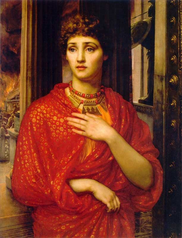


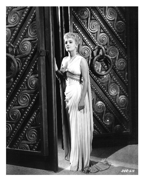

I find it interesting that Helen often seems to be a blonde or otherwise has light brown or red hair (Poynter's version is an exception). I've never gone nuts over blondes (though I have nothing against them). But the artists who did choose to depict her as blonde almost surely had that preference.
What we have here is a demonstration of subjectivity in art. Clearly the casting directors and painters strained to select an appearance that was to represent the ultimate in female beauty. (Okay, I'm not so sure about Sandy's scowling redhead.) Yet these Helens differ. And even though they differ, there's not one I'd be inclined to abduct and haul off to Troy. However, if she had dark hair and gray eyes ....
Friday, August 12, 2011
Last-Ditch Car Styling
Sometimes there's a last spurt of flame before the candle dies, or so I recall hearing it said.
True or not, something similar sometimes happens with automobile companies that are about to flat-line. In this instance it's a final roll of the dice, betting what money the company has left on a flashy model that is either brand new or (more likely, given the cost factor) a major styling face-lift.
Where money is totally lacking, nothing much gets changed and the brand dies with nothing but a whimper. Badge-engineered British makes that died in the 1960s are a case in point.
This post deals with some American brands that went down fighting with regard to styling. They are: Hupmobile, which was gone by 1940; Graham, that ceased production in the 1941 model year and had a curious afterlife (see the link for details); Kaiser, the only halfway successful post-World War 2 new brand; and Studebaker which built the Raymond Loewy designed Avanti for a few years before dying in the mid-1960s while trying to sell its Lark-based sedans with facelift after facelift after facelift.
Here are these companies' last (or nearly-so) gasps:
Gallery

The "Sharknose" (a popular name, not the official company version) Graham was largely designed by Amos Northrup as an attention-getting style in the pseudo-streamlined fashion of the 1930s. For some reason I rather like it, though it was not a sales success and the company continued its slide out of the industry.

Not a publicity shot: he actually bought one when he returned to the USA after France fell and was living in the Los Angeles area. Aside from the hood and grille, the Hollywood used body panels from the Cord brand that failed after the 1937 model year. The Cord 810 and 812 models of 1936-37 are not included here because they represented the revival of a brand that had been discontinued a few years earlier.

Hupp shared Cord bodies with Graham, though few of the Hupmobile versions were built. The car depicted is a prototype with a front that looked Cord-like apart from the tacked-on headlights (the Cord had them hidden in the fenders). Production versions looked almost identical to the Grahams shown above.

This is how the last American-built Kaisers looked. It was a major facelift of the 1953 version. Changes included the Buick-like grille, wraparound rear window and elaborate tail light housings. Production continued in South America for a few years with another facelift style.

Studebaker announced the sensational Avanti almost 50 years ago, yet the styling could just as easily be for a 2011 model aside from a few details such as the windshield angle (a 2011 would have greater slope).
Wednesday, August 10, 2011
Choose Your Favorite Tarzan
Tarzan is one of a few characters that emerged from serialized magazine stories to legendary status, where the character is known to most people (whether of not the stories were ever read) and virtually accepted as a true historical figure. I suppose Sherlock Holmes trumps Tarzan in this field, but not by a lot.
As the link above notes, Tarzan appeared on film as early as 1918, some six years after his first magazine appearance and four years after the first book. The Tarzan comic strip had to wait until 1929. Although several artists labored in the Tarzan jungle, the best known were active in the 1930s and 40s.
The originator was Hal Foster (1892-1982) who is usually associated with the long-running strip of his own creation, Prince Valiant. Burne Hogarth (1911-1996) took over Tarzan in the late 30s and continued it until 1950 (with a couple years off).
So who was the better visual interpreter of Tarzan: Foster or Hogarth? Consider the following illustrations:
Gallery

This is not from a strip, but indicates how Foster depicted the ape-man.

An isolated view of Tarzan swinging through the jungle.

Tarzan fights a lion.

Tarzan fights a lion. Compare with Foster's version above.
The lion fight scenes demonstrate the difference between the artists. Hogarth is far more dramatic, Foster more static. Foster's Prince Valiant also was comparatively stately, even in the action scenes. Hogarth's scenes often had multiple bodies twisting in exaggerated action. Also twisting would be tree trunks and vines. If water was part of the scene it would likely be surging and splashing dramatically.
So whose Tarzan do I prefer? Foster's, of course. That's because his Tarzan is more believable as a human being.
Tarzan is a character that goes beyond plausibility. Foster keeps things normal enough that the implausible bits can be accepted. Hogarth takes the inherent implausibility and makes it even more so -- not that it ruined the popularity of the comic strip.
You opinion may differ, so express it in Comments. (Comments that I have to moderate. Be patient: your comment will appear eventually.)
Monday, August 8, 2011
Edd Cartier: Wry Sci-Fi Art
Edward D. Cartier (1914-2008) was an illustrator who specialized in science-fiction. I saw his work fairly often as a budding teenager during the era when sci-fi magazines had largely abandoned their pulp heritage and were appearing in digest or semi-digest format with better quality paper. By the time I reached my twenties I'd drifted from short-story sci-fi in magazines to paperback novels and Cartier faded from my view. That was quite a while ago.
So it surprised me to learn recently while exploring the Internet that Edd (he combined the "Ed" from his given name with his middle initial to derive his professional monicker) died fairly recently after attaining an old age riper than most of us can expect. He rated an obituary in The New York Times that provides a decent amount of detail regarding his life (link here).
As the obit notes, Cartier saw combat in Europe. He was badly wounded in the Battle of the Bulge (earning a Bronze Star along with the Purple Heart) and further wounded during medical evacuation. This didn't affect his wryly humorous take on bedrock components of science fiction illustrations of the day: spaceships, alien monsters, gorgeous women and the heroic men who save them from whatever fate authors could dream up.
Contrast this with illustrator Gilbert Bundy who, I as mentioned here, could not shake off his combat zone experiences and eventually killed himself.
The market for science fiction was not large when Cartier was active in the field, so he eventually found himself day jobs and, so far as I know, continued sci-fi on the side. Very sensible.
Below are examples of Edd Cartier's work beginning with one of his pulp mag illustrations for a Shadow story before World War 2.
Gallery


I really should do a comparative analysis, but for now I'll go with my gut feeling that Cartier had more ability than almost any other sci-fi magazine illustrator active in the 1950s.
Subscribe to:
Posts (Atom)